
How to create a button
Introduction
fastn language.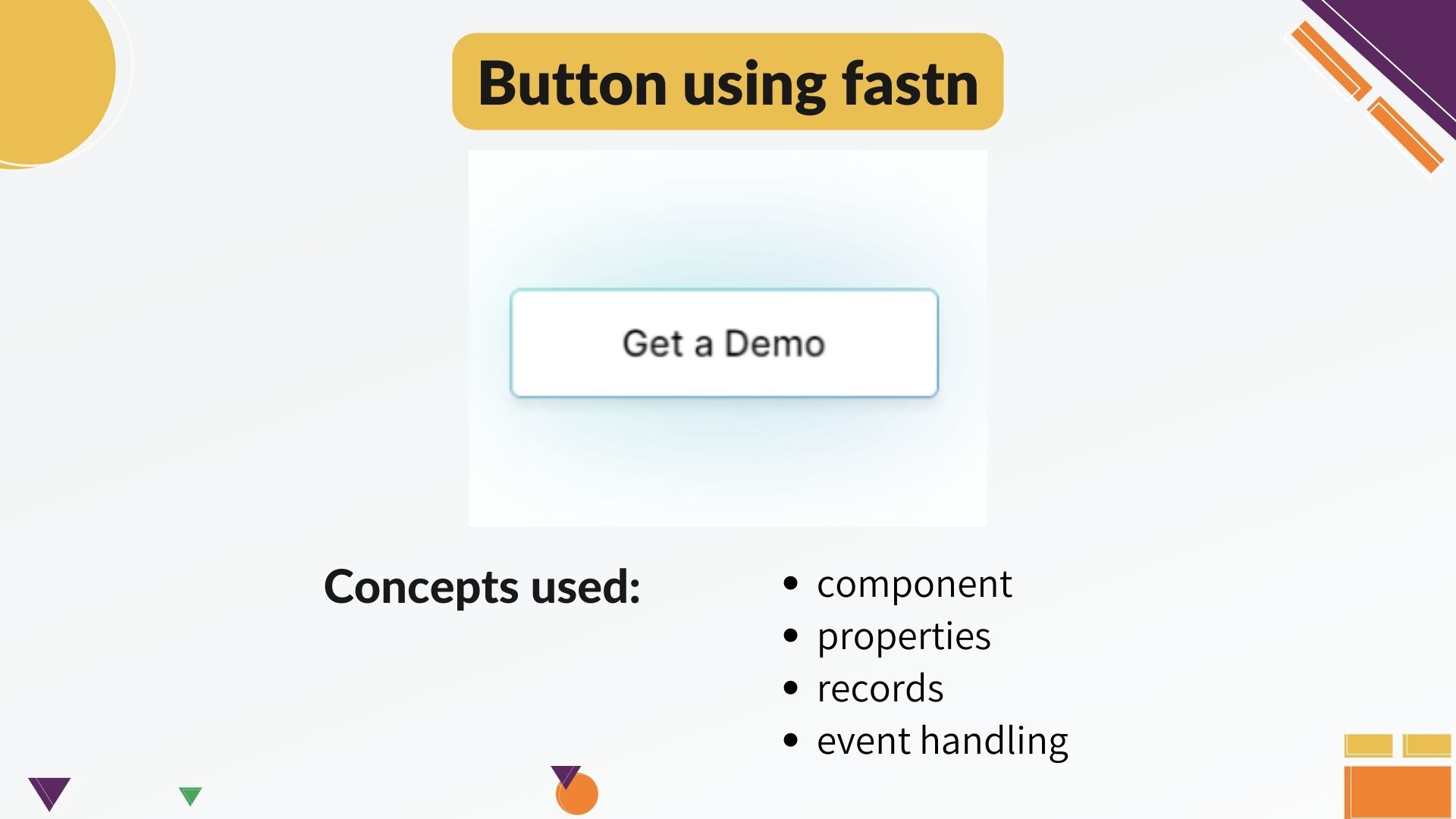
components.- To the component we will apply various properties with their respective
built-in types. Some of thePrimitive Typeslikecaption,string,booleanwhile others of theDerived Typeslikeftd.color,ftd.shadow. - We will use
recordsas well to define colors for both light and dark mode as well as shadow-color similar to what we have in second button. - We will do
event handlingthat gives shadow to the buttonon-hover.
Project buildup
component and we will call it button. The syntax is:


-- component button:

-- end: button
We will give the basic properties to this component like, title and link.
titleis ofcaptiontype.linkis ofstringtype.
optional, if you do not want to add any link to it.-- component button: caption title: optional string link: -- end: button
First, let’s create one basic button.
Inside this component we will addftd.text that will take the title, a link and apply the border property to it.-- ftd.text: $button.title link: $button.link border-width.px: 2
The dollars used here is for reference that the value in the caption of ftd.text will come from component button’s title and same for link.
ftd.text-- ftd.text: $button.title link: $button.link border-width.px: 2 padding.px: 10 border-radius.px: 6 min-width.fixed.px: 175 style: bold text-align: center
After that, we will give color and role to the text.
For that, in the component definition we have added a variable text-color of type ftd.color.
$inherited.colors to this variable. In case, the user doesn’t pass any text-color, while calling this component, it will take the inherited color from the color-scheme.-- component button: caption title: optional string link: ftd.color text-color: $inherited.colors.text-strong -- end: button
ftd.text, we will pass the reference of text-color to the color. And for the role we have passed as $inherited.type.copy-regular-- ftd.text: $button.title link: $button.link border-width.px: 2 border-radius.px: 6 padding.px: 10 min-width.fixed.px: 175 style: bold color: $button.text-color role: $inherited.types.copy-regular
role is a font specification which defines several font-related properties like font-weight, line-height, letter-spacing etc. If you want to read about roles you can checkout the ftd.responsive-type under built-in types. The URL provided in the description below.
-- component button: caption title: optional string link: ftd.color text-color: $inherited.colors.text-strong ftd.color bg-color: $inherited.colors.background.base ftd.color border-color: $inherited.colors.border-strong
-- ftd.text: $button.title link: $button.link border-width.px: 2 border-radius.px: 6 padding.px: 10 min-width.fixed.px: 175 text-align: center style: bold color: $button.text-color role: $inherited.types.copy-regular background.solid: $button.bg-color border-color: $button.border-color
-- ftd.color monochrome-dark: light: black dark: white -- ftd.color monochrome-light: light: white dark: black -- ftd.color shadow-color: light: #cae9ee dark: #e4b0ac
These variables are of record type ftd.color. You can check the URL of records to read about them.
ftd.shadow, which is also a record.-- ftd.shadow s: color: $shadow-color x-offset.px: 0 y-offset.px: 0 blur.px: 50 spread.px: 7
ftd.shadow and make it optional-- component button: caption title: optional string link: ftd.color text-color: $inherited.colors.text-strong ftd.color bg-color: $inherited.colors.background.base ftd.color border-color: $inherited.colors.border-strong optional ftd.shadow hover-shadow:
-- ftd.text: $button.title link: $button.link border-width.px: 2 border-radius.px: 6 padding.px: 10 min-width.fixed.px: 175 style: bold role: $inherited.types.copy-regular color: $button.text-color background.solid: $button.bg-color border-color: $button.border-color shadow: $button.hover-shadow
on-hover shows the shadow. So we will create a boolean variable to component definition and create two events of on-mouse-enter and on-mouse-leave.-- component button: caption title: optional string link: ftd.color text-color: $inherited.colors.text-strong ftd.color bg-color: $inherited.colors.background.base ftd.color border-color: $inherited.colors.border-strong optional ftd.shadow hover-shadow: boolean $is-hover: false
$on-mouse-enter$: $ftd.set-bool($a = $button.is-hover, v = true)
$on-mouse-leave$: $ftd.set-bool($a = $button.is-hover, v = false)
shadow if { button.is-hover }: $button.hover-shadow
Component calling
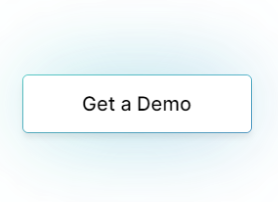
-- ftd.column:
background.solid: white
width: fill-container
align-content: center
height.fixed.px: 280


-- button: Get a Demo
hover-shadow: $s
border-color: $shadow-color
text-color: $monochrome-dark
bg-color: $monochrome-light
link: https://fastn.com/expander


-- end: ftd.column
Closing remarks
There you go, we have polished the UI and it looks similar to our original UI with our own touch to it. I hope you have learnt with me and found this video easy to follow. If you like us, you can give us a ✨ on GitHub.
Also, we would love to see your package which you will create following this video. You can share it on the dicord’s show-and-tell channel. Thank you guys.Getting Help
Have a question or need help?
Visit our GitHub Q&A discussion to get answers and subscribe to it to stay tuned.
Join our Discord channel and share your thoughts, suggestion, question etc.
Connect with our community!Found an issue?
Quick links:
Join us
We welcome you to join our Discord community today.
We are trying to create the language for human beings and we do not believe it would be possible without your support. We would love to hear from you.


